
Colour pairings
Colour with a Past
Palettes that tie decades together and make rooms easier to live in.
Borrow colour from what you own
The most convincing retro palettes are not copied from a catalogue; they are lifted from objects already in the room. A Poole Pottery vase, a faded Persian-style rug or the honey tone of a teak sideboard can each supply two or three colours. Repeat those tones across textiles, paint and small accessories, and the room starts to hang together even if its furniture spans fifty years.
A widely used rule of thumb divides a room roughly into 60 per cent main colour, 30 per cent supporting colour and 10 per cent accent. It is a guide rather than a law, but it helps prevent a strong retro shade such as orange from taking over. Try samples on more than one wall and look at them in morning and evening light before deciding.
Pairing one
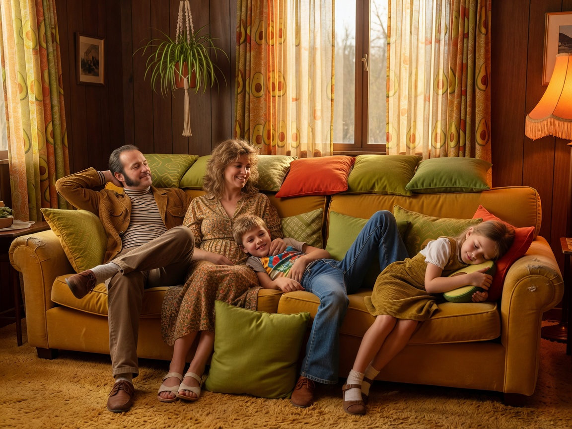
Seventies warmth: avocado, mustard and orange
These shades defined many kitchens and bathrooms of the 1970s. Used all at once and at full strength they can feel heavy, but softened with plenty of cream and natural wood they become cosy. Keep the brightest tone for cushions or a single lampshade.
- Avocado
#6B7A2A - Mustard
#C9A227 - Burnt orange
#B5541C - Cream
#F3EAD3
Pairing two
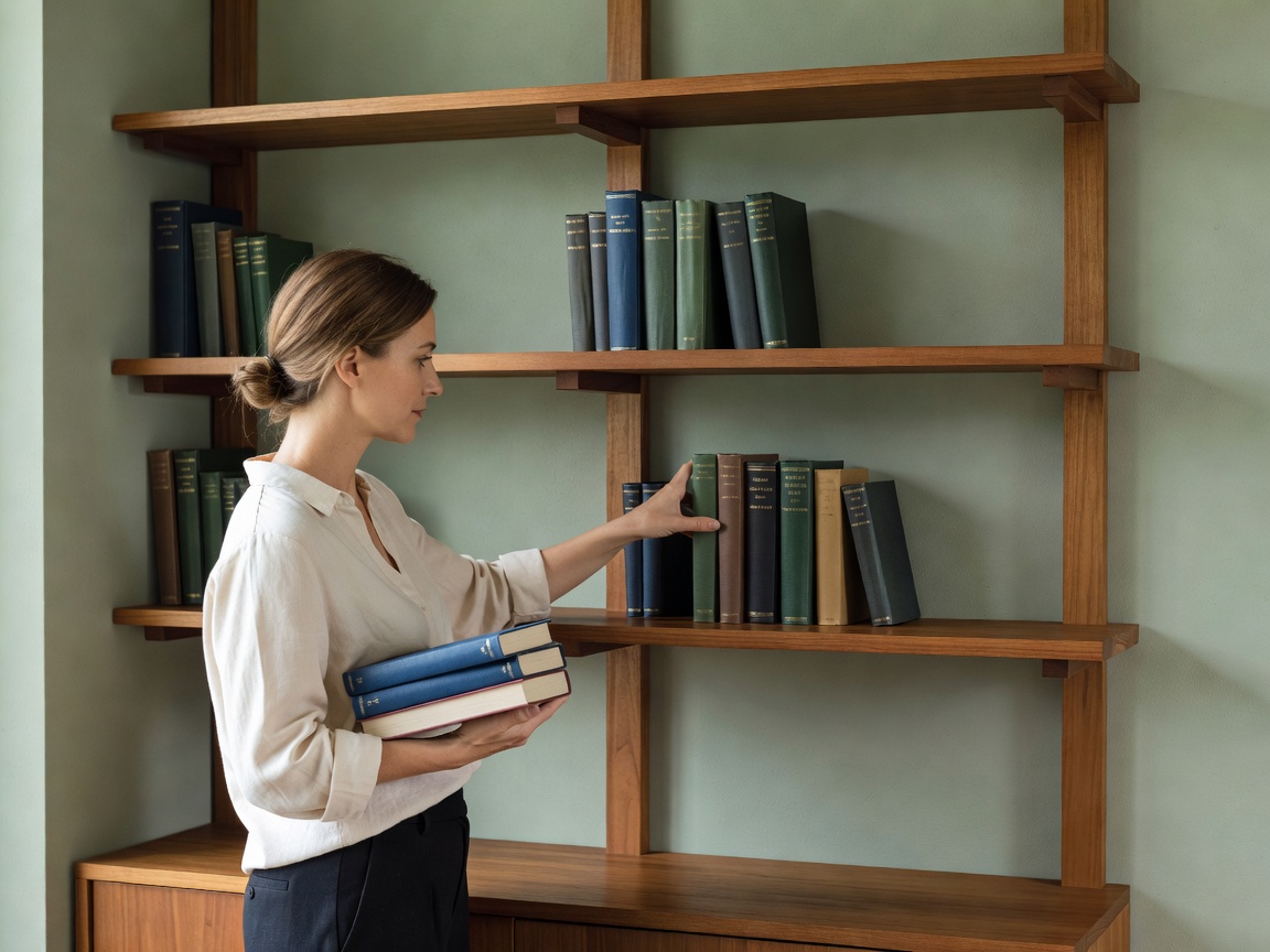
Scandinavian calm: teak, sage and parchment
Danish Modern interiors leaned on natural timber and quiet backgrounds. Sage and parchment let the warm grain of teak take centre stage, which suits anyone who finds bold colour tiring. Add charcoal in small doses, such as a lamp base or picture frames, for definition.
- Teak
#8A5A33 - Sage
#9CAE8F - Parchment
#F3EAD3 - Charcoal
#2F3437
Pairing three
Festival brights and fifties pastels
The 1951 Festival of Britain popularised cheerful accents, including the textile designs of Lucienne Day, while 1950s kitchens often favoured mint and primrose. Pair a confident red with plenty of cream, or let pastel mint and primrose share a breakfast nook with olive as an anchor.
- Festival red
#B8322C - Kitchen mint
#BFE3CF - Primrose
#F2E6A0 - Olive
#5E6B3A

Making colour comfortable, not costume
- Start with textiles. Cushions, throws and curtains let you test a palette before painting.
- Mind contrast. Dark text on pale walls, clear light switches against dark paint and well-lit stairs keep rooms easy to use for everyone.
- Respect wood tone. Warm timbers sit well with warm or earthy colours; cooler greys can make teak look orange.
- Use one modern neutral. A plain off-white ceiling or woodwork gives the eye a rest.
- Change gradually. Paint one wall, live with it, then decide on the next.
Colour should make a room feel calmer or livelier according to how you use it. A study may welcome deep olive; a north-facing hallway may thank you for primrose. Choose for the life in the room, not for period accuracy. For more ideas on what to pair with your palette, see room stories.